The default browser styles display the table and its cells without visible borders or background, and the cells within the table are not adjacent to each other. Using CSS styles, you can beautifully design a table in accordance with its content.

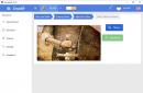
Tables with spaces between rows help you focus on related information located in the same row of the table, but in adjacent cells. In order to separate the text from the image, place it in another cell, while merging two cells in the table header
HTML markup
CSS Styles
table (
border-spacing: 0 10px;
font-family: "Open Sans", sans-serif;
font-weight: bold;
}
th (
padding: 10px 20px;
background: #56433D;
color: #F9C941;
border-right: 2px solid;
font-size: 0.9em;
}
th:first-child (
text-align: left;
}
th:last-child (
border-right: none;
}
td(
vertical-align: middle;
padding: 10px;
font-size: 14px;
text-align: center;
border-top: 2px solid #56433D;
border-bottom: 2px solid #56433D;
border-right: 2px solid #56433D;
}
td:first-child (
border-left: 2px solid #56433D;
border-right: none;
}
td:nth-child(2)(
text-align: left;
}

Using this technique, you can effectively design a table using contrasting colors, which will harmoniously fit into the color scheme of your site.
HTML markup
| Company | Q1 | Q2 | Q3 | Q4 |
|---|---|---|---|---|
| Microsoft | 20.3 | 30.5 | 23.5 | 40.3 |
| 50.2 | 40.63 | 45.23 | 39.3 | |
| Apple | 25.4 | 30.2 | 33.3 | 36.7 |
| IBM | 20.4 | 15.6 | 22.3 | 29.3 |
CSS Styles
table (
font-size: 14px;
border-collapse: collapse;
text-align: center;
}
th, td:first-child (
background: #AFCDE7;
color: white;
padding: 10px 20px;
}
th, td (
border-style: solid;
border-width: 0 1px 1px 0;
border-color: white;
}
td(
background: #D8E6F3;
}
text-align: left;
}

Thanks to the addition of the border-radius property to the CSS3 specification, it is now possible to round the corners of a table without using background images. To achieve this effect, you need to round the corners of the corresponding cells.
HTML markup
- similar to example 2.
CSS Styles
table (
font-family: "Lucida Sans Unicode", "Lucida Grande", Sans-Serif;
font-size: 14px;
border-radius: 10px;
border-spacing: 0;
text-align: center;
}
th (
background: #BCEBDD;
color: white;
text-shadow: 0 1px 1px #2D2020;
padding: 10px 20px;
}
th, td (
border-style: solid;
border-width: 0 1px 1px 0;
border-color: white;
}
th:first-child, td:first-child (
text-align: left;
}
th:first-child (
}
th:last-child (
border-right: none;
}
td(
padding: 10px 20px;
background: #F8E391;
}
tr:last-child td:first-child (
border-radius: 0 0 0 10px;
}
tr:last-child td:last-child (
border-radius: 0 0 10px 0;
}
tr td:last-child (
border-right: none;
}
4. Table with separate cells
HTML markup
- similar to example 2.
CSS Styles
table (
font-family: "Lucida Sans Unicode", "Lucida Grande", Sans-Serif;
text-align: left;
border-collapse: separate;
border-spacing: 5px;
background: #ECE9E0;
color: #656665;
border: 16px solid #ECE9E0;
border-radius: 20px;
}
th (
font-size: 18px;
padding: 10px;
}
td(
background: #F5D7BF;
padding: 10px;
}

HTML markup
| My working weeks, March 2015 | ||||
|---|---|---|---|---|
| Monday | Tuesday | Wednesday | Thursday | Friday |
| 2 | 3 | 4 | 5 | 6 |
| 9 | 10 | 11 | 12 | 13 |
| 16 | 17 | 18 | 19 | 20 |
| 23 | 24 | 25 | 26 | 27 |
| 30 | 31 | |||
CSS Styles
table (
font-family: "Lucida Sans Unicode", "Lucida Grande", Sans-Serif;
text-align: center;
border-collapse: collapse;
border-spacing: 5px;
background: #E1E3E0;
border-radius: 20px;
}
th (
font-size: 22px;
font-weight: 300;
padding: 12px 10px;
color: #F56433;
}
tbody tr:nth-child(2) (
border-bottom: 2px solid #F56433;
}
td(
padding: 10px;
color: #8D8173;
}

HTML markup
| Employee | Salary | Bonus | Supervisor |
|---|---|---|---|
| Stephen C. Cox | $300 | $50 | Bob |
| Josephine Tan | $150 | — | Annie |
| Joyce Ming | $200 | $35 | Andy |
| James A. Pentel | $175 | $25 | Annie |
CSS Styles
table (
font-family: "Lucida Sans Unicode", "Lucida Grande", Sans-Serif;
font-size: 14px;
text-align: left;
border-collapse: collapse;
border-radius: 20px;
box-shadow: 0 0 0 10px #F2906B;
color: #452F21;
}
th (
padding: 10px 8px;
background:white;
}
table th:first-child (
border-top-left-radius: 20px;
}
table th:last-child (
border-top-right-radius: 20px;
}
td(
border-top: 10px solid #F2906B;
padding: 8px;
background:white;
}
table td:first-child (
border-bottom-left-radius: 20px;
}
table td:last-child (
border-bottom-right-radius: 20px;
}

A vertical zebra in the table design will allow you to emphasize the columns, and the effect when hovering over a row will add attractiveness to such a table.
HTML markup
| Q1 | Q2 | Q3 | Q4 | |
|---|---|---|---|---|
| Microsoft | 20.3 | 30.5 | 23.5 | 40.3 |
| 50.2 | 40.63 | 45.23 | 39.3 | |
| Apple | 25.4 | 30.2 | 33.3 | 36.7 |
| IBM | 20.4 | 15.6 | 22.3 | 29.3 |
CSS Styles
table (
border-spacing: 0;
empty-cells: hide;
}
td(
padding: 10px 20px;
text-align: center;
transition: all 0.5s linear;
}
td:first-child (
text-align: left;
color: #3D3511;
font-weight: bold;
}
th (
padding: 10px 20px;
color: #3D3511;
border-bottom: 1px solid #F4EEE8;
border-top-left-radius: 10px;
border-top-right-radius: 10px;
}
td:nth-child(even) (
background: #F6D27E;
}
td:nth-child(odd) (
background: #D1C7BF;
}
th:nth-child(even) (
background: #F6D27E;
}
th:nth-child(odd) (
background: #D1C7BF;
}
.round-top (
border-top-left-radius: 5px;
}
.round-bottom (
border-bottom-left-radius: 5px;
}
tr:hover td(
background: #D1C7BF;
font-weight: bold;
}

HTML markup
CSS Styles
table (
font-family: "Lucida Sans Unicode", "Lucida Grande", Sans-Serif;
border-collapse: collapse;
color: #686461;
}
caption (
padding: 10px;
color: white;
background: #8FD4C1;
font-size: 18px;
text-align: left;
font-weight: bold;
}
th (
border-bottom: 3px solid #B9B29F;
padding: 10px;
text-align: left;
}
td(
padding: 10px;
}
tr:nth-child(odd) (
background:white;
}
tr:nth-child(even) (
background: #E8E6D1;
}

HTML markup
| Comedy | Adventure | Action | Children |
|---|---|---|---|
| Scary Movie | Indiana Jones | The Punisher | Wall-E |
| Epic Movie | Star Wars | Bad Boys | Madagascar |
| Spartan | LOTR | Die Hard | Finding Nemo |
| Dr. Dolittle | The Mummy | 300 | A Bug's Life |
CSS Styles
Table_col(
font-family: "Lucida Sans Unicode", "Lucida Grande", Sans-Serif;
font-size: 14px;
width: 660px;
background:white;
text-align: left;
border-collapse: collapse;
color: #3E4347;
}
.table_col th:first-child, .table_col td:first-child (
color: #F5F6F6;
border-left: none;
}
.table_col th(
font-weight: normal;
border-bottom: 2px solid #F5E1A6;
padding: 8px 10px;
}
.table_col td(
border-right: 20px solid white;
border-left: 20px solid white;
padding: 12px 10px;
color: #8b8e91;
}

HTML markup
| Company | Q1 | Q2 | Q3 | Q4 |
|---|---|---|---|---|
| Microsoft | 20.3 | 30.5 | 23.5 | 40.3 |
| 50.2 | 40.63 | 45.23 | 39.3 | |
| Apple | 25.4 | 30.2 | 33.3 | 36.7 |
| IBM | 20.4 | 15.6 | 22.3 | 29.3 |
CSS Styles
table_blur(
background: #f5ffff;
border-collapse: collapse;
text-align: left;
}
.table_blur th (
border-top: 1px solid #777777;
box-shadow: inset 0 1px 0 #999999, inset 0 -1px 0 #999999;
background: linear-gradient(#9595b6, #5a567f);
color: white;
padding: 10px 15px;
position: relative;
}
.table_blur th:after (
content: "";
display: block;
position: absolute;
left: 0;
top: 25%;
height: 25%;
width: 100%;
background: linear-gradient(rgba(255, 255, 255, 0), rgba(255,255,255,.08));
}
.table_blur tr:nth-child(odd) (
background: #ebf3f9;
}
.table_blur th:first-child (
border-left: 1px solid #777777;
border-bottom: 1px solid #777777;
box-shadow: inset 1px 1px 0 #999999, inset 0 -1px 0 #999999;
}
.table_blur th:last-child (
border-right: 1px solid #777777;
border-bottom: 1px solid #777777;
box-shadow: inset -1px 1px 0 #999999, inset 0 -1px 0 #999999;
}
.table_blur td (
border: 1px solid #e3eef7;
padding: 10px 15px;
position: relative;
transition: all 0.5s ease;
}
.table_blur tbody:hover td (
color: transparent;
text-shadow: 0 0 3px #a09f9d;
}
.table_blur tbody:hover tr:hover td (
color: #444444;
text-shadow: none;
}

Tables are a widely used element for presenting various data in presentations, lectures, flyers and more. Due to their clarity, versatility and simplicity, tables are also widely used on websites in order to better convey the necessary material to the reader. By adding the full power of styles to tables, you can very successfully fit tables into the website design and present tabular data clearly and beautifully.
Table width
By default, the width of the table is set by the browser itself, based on the volume of tabular data in it. If there is a lot of text in the cells, then the table will occupy the entire width available to it, and if there is not enough text, then the table width will automatically decrease. If there are several tables on a page, their different widths sometimes look careless. So it's better to explicitly set the table width in percentages, pixels, ems, or any other CSS units, as shown in Example 1.
Example 1: Table width in percentage
Table ( width: 100%; ) .tbl-medium ( width: 60%; ) .tbl-small ( width: 200px; )
In this example, a width of 100% is applied to all tables. Again, classes help set the width for selected tables using a previously created class. To give the table a width of 200 pixels, you need to add to the element
In this example, all tables on the page are set to center alignment.
Background color
The background color of all table cells at the same time is set through the background property, which is applied to the table selector. In this case, you should remember the rules for using styles, in particular, the inheritance of element properties. If at the same time as table you set a color for the td or th selector, then it will be set as the background (example 3).
Example 3: Background color
| Type of connection | ||
|---|---|---|
| Shaft | Sleeve | |
| Free | H9 | D10 |
| Normal | N9 | I s 9 |
| Dense | P9 | |
The result of this example is shown in Fig. 1.
Rice. 1. Change background color
If we want to make a zebra pattern, which is the name given to alternating lines of different colors, then we should use the :nth-child pseudo-class, adding it to the tr selector. In order for the zebra to extend only to the body of the table, and not its header, we separate them from each other using elements And
(example 4).Example 4: Creating a Zebra
| Size intervals, mm | IT tolerance, µm, for qualifications | |||
|---|---|---|---|---|
| 5 | 6 | 7 | 8 | |
| Until 3 | 4 | 6 | 10 | 14 |
| St. 3 to 6 | 5 | 8 | 12 | 18 |
| St. 6 to 10 | 6 | 9 | 15 | 22 |
| St. 10 to 18 | 8 | 11 | 18 | 27 |
| St. 18 to 30 | 9 | 13 | 21 | 33 |
| St. 30 to 50 | 11 | 16 | 25 | 39 |
| St. 50 to 80 | 13 | 19 | 30 | 46 |
The result of this example is shown in Fig. 2.

Rice. 2. Zebra
The even value of the :nth-child selector applies the style to all even-numbered rows and sets their background color. You can also change it to odd , then odd lines will be highlighted in gray.
Similarly, columns, not rows, are highlighted with color; for this you should use the tbody selector td:nth-child(even) .
Margins inside cells
Margin is the distance between the cell border and its contents. Without margins, the text in the table “sticks” to the frame, thereby impairing its perception, but adding margins improves the readability of the text. For this purpose, the padding style property is used, which works with the td or th selector, as shown above in examples 3 and 4. Typically, a single value is specified, which then specifies the empty space around the contents of the cell on all sides at once. Two values are written when you need to set different fields vertically (first value) and horizontally (second value).
Distance between cells
There is a small empty space between the cells, which is not visible until you set a border for the cells or background color. This spacing is initially 2px and can be changed using the border-spacing property by adding it to the table selector (Example 5).
Example 5: Using border-spacing
Table ( border-spacing: 3px; /* Space between cells */ ) thead th ( background: #e08156; /* Header background color */ color: #333; /* Text color */ ) td, th ( padding: 5px ; /* Fields in cells */ background: #4c715b; /* Background color of cells */ color: #f5e8d0; /* Text color */ )
Adding this style to any table we get the result shown in Fig. 3.

Rice. 3. Table view with distance between cells
If the border-collapse property is added to the table with the value collapse , then border-spacing is ignored, because there is no longer any distance between the cells.
Borders and frames
To clearly separate the contents of one cell from another, borders are added to the cells. They are created by the border style property, which is applied to elements (
Example 6: Using the border-collapse property when creating table borders
| O | X | X |
| O | O | X |
| X | X | O |
The difference between table borders with and without the border-collapse property is shown in Fig. 4.


Rice. 4. Table view when using border-collapse
In Fig. Figure 4a shows the default table frame. Please note that inside the table all lines have double thickness. Adding border-collapse removes this feature, and the thickness of all lines becomes the same (Fig. 4b).
Lines do not have to be on all sides of cells, but can be designed to separate one row or column from another. To do this, we use the border-bottom , border-left and other similar properties. Apply borders to elements
Example 7. Lines between lines
| Type of connection | Tolerance fields for keyway width | |
|---|---|---|
| Shaft | Sleeve | |
| Free | H9 | D10 |
| Normal | N9 | I s 9 |
| Dense | P9 | |
The result of this example is shown in Fig. 5.

Rice. 5. Table with horizontal lines
By default, text in a table cell is left-aligned and center-aligned. The exception is the element
Example 8: Aligning Cell Contents Horizontally
| Heading 1 | Cell 1 | Cell 2 |
|---|---|---|
| Heading 2 | Cell 3 | Cell 4 |
In this example, the content

Rice. 6. Aligning text in cells
Vertical alignment in a cell is always centered unless otherwise noted. This is not always convenient, especially for tables whose cell contents vary in height. In this case, the alignment is set to the top edge of the cell using the vertical-align property with a value of top , as shown in Example 9.
Example 9. Aligning cell contents vertically
| Type of connection | Tolerance fields for keyway width | |
|---|---|---|
| Shaft | Sleeve | |
| Free | H9 | D10 |
| Normal | N9 | I s 9 |
| Dense | P9 | |
In this example, the text is aligned to the top edge. The result of the example is shown in Fig. 7.

The purpose of the lesson: Introduction to table properties and CSS table layout principles
Let's look at the basic CSS table properties
border
A property is considered in one and includes several properties simultaneously:
- BORDER-STYLE
- BORDER-WIDTH
- BORDER-COLOR
There is also a general rule:
table.collapse( border-collapse:collapse; ) table.separate( border-collapse:separate; )
Result:
width and height
(table height and width)
Values:
Example:
text-align
(horizontal alignment)
Values:
- center (center)
- left (along the left edge)
- right (right edge)
- justify (width)
vertical-align
(vertical alignment)
Values:
- baseline (along the baseline)
- sub (as subindex)
- super (like superindex)
- top (along the top edge)
- middle (in the middle)
- bottom (along the bottom edge)
- % (of line spacing height)
Example:
padding
(internal indents in the table)
background-color (background)
color (text color)
CSS table layout
Due to the large number of table properties and variations in their design, tables have long been a standard for web page layout. If you make the borders of the table invisible, you can use its individual cells as separate blocks of the page: header, menu, footer, etc.
But this is not entirely correct, because each tag has its own purpose, and the tables should not have been used for page layout. However, the lack of an alternative prompted designers to use this particular layout method.
Now there is another way - using layers, which have gradually replaced tables in this type of work with a web page. However, even in our time, some designers successfully use table layout.
Tabular layout with two columns
One of the most common layout methods is two columns, i.e. The page is divided into two parts.
Example: set the main frame of the page from two columns: the first - with a fixed size, the second - for the remaining area of the browser. Complete the task using CSS styles ()
Performance:
| </head> <body > <table id = "maket" cellspacing = "0" > <tr > <td id = "left" > 1</td> <td id = "right" > 2</td> </tr> </table> ... |
| 1 | 2 |
Result:
Example: set different background cells (to separate two columns from each other) and set the distance between columns (separator)
Performance:
Let's add new style properties:
/* for the left cell */ td#left( width:200px; background: #ccc; border:1px solid black; /* temporarily mark the borders */ ) /* for the right cell */ td#right( background: #fc3; border:1px solid black; /* temporarily mark the borders */ ) /* for the divider */ #razdel( width: 10px; /* Distance between columns */ )
Together:
| </head> <body > <table id = "maket" cellspacing = "0" > <tr > <td id = "left" > 1</td> <td id = "razdel" > <td id = "right" > 2</td> </tr> </table> |
| 1 | 2 |
A new cell has been added for the separator.
Result:
Example: make a separator between table columns using a dotted line bordering adjacent cells
Performance:
Let's add new border properties for cells:
/* for the left cell */ td#left( width:200px; background: #ccc; /* Left column background color */ /* new */ border-right: 1px dashed #000; /* Right dashed border options */ )
Together:
| </head> <body > <table id = "maket" cellspacing = "0" > <tr > <td id = "left" > 1</td> <td id = "right" > 2</td> </tr> </table> |
| 1 | 2 |
Result:
Table layout with three columns
There is a concept of a fixed or “fluid” layout.
Fixed CSS Layout
- Using fixed layout the width of the entire table is specified in pixels, and then, regardless of the resolution of the monitor and browser window, the table will always have the same width.
- In this case The width of the remaining columns should also be fixed.
- You can not specify the width of one cell, then it will be calculated automatically based on the sizes of the remaining cells and the entire table.
Example: create a three-column page template. Use a fixed table layout:
- left column - 150 pixels;
- middle column - 400 pixels;
Performance:
| </head> <body > <table id = "maket" cellspacing = "0" > <tr > <td id = "left" > 1</td> <td id = "central" > 2</td> <td id = "right" > 3</td> </tr> </table> |
| 1 | 2 | 3 |
Result:
Rubber mockup
- Table width when using "rubber" design set as % of browser window width. That. When the browser window changes, the table size also changes.
- Width of all cells can be installed in percentages.
- The second option is when width of some cells is installed in percentages, A some - in pixels.
Important: The sum of the widths of all columns should be 100%, regardless of the width of the table.
Example:
- left column - 20%;
- middle column - 40%;
- right column - 40%;
Set a background for the columns and visually separate the columns with a border.
Performance:
| </head> <body > <table id = "maket" cellspacing = "0" > <tr > <td id = "left" > 1</td> <td id = "central" > 2</td> <td id = "right" > 3</td> </tr> </table> |
| 1 | 2 | 3 |
Result:
Let's consider the second option, when the width of the central column is automatically selected by the browser; An example is the following picture: 
Example: create a three-column page template. Use a fluid table layout:
- left column - 150 pixels;
- middle column - 40%;
- right column - 200 pixels;
Set a background for the columns and visually separate the columns with a border.
Performance:
| </head> <body > <table id = "maket" cellspacing = "0" > <tr > <td id = "left" > 1</td> <td id = "central" > 2</td> <td id = "right" > 3</td> </tr> </table> |
| 1 | 2 | 3 |
Result:
The result will be approximately the same, only the “stretching” will occur due to the central column.
Using a nested table in a fluid layout
If the width of two columns is set in percentages, and the third in pixels, you won’t be able to get by with just one table. So, if the width of the entire table is 100 percent, the first column is 200 pixels, and the remaining columns are 20 percent, then a simple calculation shows that the size of the first column is 60 percent. In this case, the specified value in pixels will not be accepted by the browser, and the size will be set as a percentage. 
- The original table is created with two cells. The table width is set as a percentage.
- For left cell(first column) width is set in pixels.
- Right cell width(basis for other columns) not specified. A second table, also consisting of two cells, is inserted inside this cell.
- The width of nested table cells is set as a percentage.
- The width of the inner table should be set to 100 percent so that this table takes up all the free space in the external table.
- The width of the center and right columns is calculated relative to the width of the cell, not the outer table as a whole.
Example: create a three-column page template. Use fluid layout with nested table:
- left column - 150 pixels;
- middle column - 60%;
- right column - 40%;
Set the background for the columns.
Performance:
The cellpadding and cellspacing tag attributes are necessary here to ensure that there is no “gap” between the tables. The purpose of the lesson: Introduction to table properties and CSS table layout principles Let's look at the basic CSS table properties borderA property is considered in one and includes several properties simultaneously:
There is also a general rule: table.collapse( border-collapse:collapse; ) table.separate( border-collapse:separate; ) Result: width and height
| ||||||||||||||||||||||||||||||||||||||||||||||||||||||||||||||||
| </head> <body > <table id = "maket" cellspacing = "0" > <tr > <td id = "left" > 1</td> <td id = "right" > 2</td> </tr> </table> ... |
| 1 | 2 |
Result:
Example: set different cell backgrounds (to separate two columns from each other) and set the distance between columns (separator)
Performance:
Let's add new style properties:
/* for the left cell */ td#left( width:200px; background: #ccc; border:1px solid black; /* temporarily mark the borders */ ) /* for the right cell */ td#right( background: #fc3; border:1px solid black; /* temporarily mark the borders */ ) /* for the divider */ #razdel( width: 10px; /* Distance between columns */ )
Together:
| </head> <body > <table id = "maket" cellspacing = "0" > <tr > <td id = "left" > 1</td> <td id = "razdel" > <td id = "right" > 2</td> </tr> </table> |
| 1 | 2 |
A new cell has been added for the separator.
Result:
Example: make a separator between table columns using a dotted line bordering adjacent cells
Performance:
Let's add new border properties for cells:
/* for the left cell */ td#left( width:200px; background: #ccc; /* Left column background color */ /* new */ border-right: 1px dashed #000; /* Right dashed border options */ )
Together:
| </head> <body > <table id = "maket" cellspacing = "0" > <tr > <td id = "left" > 1</td> <td id = "right" > 2</td> </tr> </table> |
| 1 | 2 |
Result:
Table layout with three columns
There is a concept of a fixed or “fluid” layout.
Fixed CSS Layout
- Using fixed layout the width of the entire table is specified in pixels, and then, regardless of the resolution of the monitor and browser window, the table will always have the same width.
- In this case The width of the remaining columns should also be fixed.
- You can not specify the width of one cell, then it will be calculated automatically based on the sizes of the remaining cells and the entire table.
Example: create a three-column page template. Use a fixed table layout:
- left column - 150 pixels;
- middle column - 400 pixels;
Performance:
| </head> <body > <table id = "maket" cellspacing = "0" > <tr > <td id = "left" > 1</td> <td id = "central" > 2</td> <td id = "right" > 3</td> </tr> </table> |
| 1 | 2 | 3 |
Result:
Rubber mockup
- Table width when using "rubber" design set as % of browser window width. That. When the browser window changes, the table size also changes.
- Width of all cells can be installed in percentages.
- The second option is when width of some cells is installed in percentages, A some - in pixels.
Important: The sum of the widths of all columns should be 100%, regardless of the width of the table.
Example:
- left column - 20%;
- middle column - 40%;
- right column - 40%;
Set a background for the columns and visually separate the columns with a border.
Performance:
| </head> <body > <table id = "maket" cellspacing = "0" > <tr > <td id = "left" > 1</td> <td id = "central" > 2</td> <td id = "right" > 3</td> </tr> </table> |
| 1 | 2 | 3 |
Result:
Let's consider the second option, when the width of the central column is automatically selected by the browser; An example is the following picture:
Example: create a three-column page template. Use a fluid table layout:
- left column - 150 pixels;
- middle column - 40%;
- right column - 200 pixels;
Set a background for the columns and visually separate the columns with a border.
Performance:
| </head> <body > <table id = "maket" cellspacing = "0" > <tr > <td id = "left" > 1</td> <td id = "central" > 2</td> <td id = "right" > 3</td> </tr> </table> |
| 1 | 2 | 3 |
Result:
The result will be approximately the same, only the “stretching” will occur due to the central column.
Using a nested table in a fluid layout
If the width of two columns is set in percentages, and the third in pixels, you won’t be able to get by with just one table. So, if the width of the entire table is 100 percent, the first column is 200 pixels, and the remaining columns are 20 percent, then a simple calculation shows that the size of the first column is 60 percent. In this case, the specified value in pixels will not be accepted by the browser, and the size will be set as a percentage.
- The original table is created with two cells. The table width is set as a percentage.
- For left cell(first column) width is set in pixels.
- Right cell width(basis for other columns) not specified. A second table, also consisting of two cells, is inserted inside this cell.
- The width of nested table cells is set as a percentage.
- The width of the inner table should be set to 100 percent so that this table takes up all the free space in the external table.
- The width of the center and right columns is calculated relative to the width of the cell, not the outer table as a whole.
Example: create a three-column page template. Use fluid layout with nested table:
- left column - 150 pixels;
- middle column - 60%;
- right column - 40%;
Set the background for the columns.
Performance:
The cellpadding and cellspacing tag attributes are necessary here to ensure that there is no “gap” between the tables. In this article you will see how to use CSS styles format tables. In the early days of the Internet, designers often used tables to create layouts. Now almost all sites are marked with CSS help, and tables are used for their intended purpose - to display data. Tags for table layoutThe table can be made using following tags:
| ||||||||||||||||||||||||||||||||