Every mother dreams of capturing her child’s birthday as brightly as possible. Today, for this purpose, there is a special metric poster - a poster that displays basic information about the baby: his name, day and time of birth, weight, height, etc. This beautiful thing becomes a wonderful decoration for a child’s room and emphasizes the individuality of its owner. The only drawback is that, like any exclusive image, the metric requires payment for the designer’s work.
You can save on creating a layout by drawing it yourself or using templates from the Internet. However, to make a high-quality image, you will need skills in working with graphic editors. What if you are not a designer, but want to create a metric for a newborn for free? The website http://bambinic.ru will come to the rescue. It is an online store of designer children's clothing, complemented by a free service for creating online metrics posters. It can be done very quickly without much effort.
How to make an achievement poster online?
The site offers about 50 layouts of ready-made images, where all you have to do is enter the necessary data about the child or upload his photo. All presented options have different author’s designs, which will definitely suit both you and your baby.
There is a suitable picture for any age on the site, because the archive contains not only the classic metric poster for newborns, but also personalized posters, as well as cards for Halloween, New Year and March 8th. Even for mothers who are just expecting a baby, there is their own option - posters with a window for ultrasound images.
The finished image will be sent to your email in A3, A4 and A5 formats, after which you can print them on your printer or in a printing house. You can try to make a metrics poster for children.
Poster metrics for newborns in just three clicks
There are several others on the Internet, but only Bambinic provides functionality specifically for children’s metrics.
To work on the site, registration or authorization through social networks is not required. The process of creating a picture consists of only three steps:
- design choice;
- entering child data;
- sending the layout to your email.

Stylish do-it-yourself element of children's interior
Want to create an achievement poster for your baby's one year old? The service will help you do this for free online. Such a poster can be shown to guests at a children's party and given to close relatives as a souvenir.

The design of the metric poster echoes the prints of clothes produced by Bambinic, so the company offers to complement the gift for the child by purchasing themed T-shirts, dresses, sweatshirts, etc. In addition, on the website you can buy colorful mini-books containing the characters depicted on the posters and clothes, come to life and teach kids goodness.
Note that there is not a single worthy analogue of Bambinic on the network yet. All such services offer only paid services: development of an individual layout and its printing.
Spend money on an exclusive metric poster for children or create one using free online templates - the choice is yours. In any case, the image will become a source of pride for you and will take pride of place in the children's room.
All this is a service BAMBINIK POSTER
A colorful poster for a children's room with an individual design and personal details of the child is a wonderful decorative element and an excellent gift for any occasion. Millions of mothers around the world order expensive designer posters for their children, now you can do it absolutely free! Choose a design to suit your taste, enter the name and additional information about the child's achievements, print it on your home printer or at a copy center... that's it! Let the masterpiece take pride of place in the nursery.
Usage options:
Create a memorable baby birth poster: it will be a great reminder of the touching day of the birth of a new family member! Share the news on social networks and print the poster in large format for interior decoration.
Make a great gift for a child you know for a holiday or just like that in 2 minutes - print it out, put it in a frame - and give it with pleasure! The delight of the child and his parents is guaranteed:)
On the eve of your child's birthday, prepare a poster with the achievements of your grown-up baby and decorate the sweet table. A children's holiday today is not complete without this proud detail of the celebration! Don’t forget to tell your friends about this joyful event on social networks.
A children's poster with achievements (wall newspaper) can be presented to your beloved grandparents so that they always have a reason to be proud.
Choose a minimalist name poster design for a child of any age and decorate the nursery just because.
We are constantly working on creating new designs and would love to hear your feedback and comments.
Happy creativity!
In this tutorial we're going to create a design for a sample typography poster. We will use: standard brushes, lighting effects and much more to achieve the final result. The methods and skills that we will consider will be useful to you in the future!
Let's fire up Photoshop and get started!
Lesson materials:
Here's the image we'll be creating today:
Step 1
Let's start our work by finding a good font. In most cases, you can find a suitable font, but sometimes it is better to create it yourself to get exactly the desired result.
For educational purposes, I'm going to use a font that is available for free download.
After downloading the font, create a new 11" x 8.5" inch document; resolution: 300 dots\inch (dpi); RGB mode.
Using the new font you downloaded, write a few words in the center of the document. There are two font styles that come inside the folder, we'll use both.
Translator's note: the font size will be 50-110 pt (depending on your phrase). Make the central inscription twice as large as the rest of the text.
The phrase I came up with can be placed in three lines. The middle line will be written in bold (CODE bold), and the first and third lines will be written in normal (CODE light). Center text vertically and save your work.

Step 2
Download the Smoke brushes. Create a new layer above the bold text. Name it whatever you like (for example, "Smoke"). Once you've done this, use, on a new layer, different smoke brushes in the "Bold" text area, as shown in the image below:

Step 3
While standing on the "Smoke" layer, press and hold the key Ctrl, click on the thumbnail of the layer with the text "Bold" to activate the selection:

Then click Ctrl+J. This way we will create a duplicate of the smoke, but in the form of letters (name the layer “Text smoke”).
Turn off the visibility of the "Smoke" layer as well as the original "Bold" text layer to see the result. Now the "Smoke" layer can be deleted.

Step 4
Create a new layer at the very top of the layers palette. Select tool " Gradient \ Gradient Tool" (G). Make sure you are using "radial gradient"- from white to transparent. The settings should look like the image below:
On the new layer (name it "Lights") that you created, use a radial gradient several times, placing it on the image in the areas indicated in the screenshot:

Step 5
Create a new layer on top of all the others. Switch to tool " Gradient \ Gradient Tool" (G). Next, apply the following settings for your "radial gradient":

Drag the gradient line from the middle of the canvas to the edge (to any corner), and then change the blending mode of this layer to "Linear Burn".

Step 6
Change the blending mode of the text layer to "Bold" to "Screen". Double click on this layer and apply the following layer style settings:

After applying the settings, your image should look something like this:

Step 7
Go to the layer with the "Let's Grow" text. Double click on the layer to go to "Layer Style". Select a tab "Gradient Overlay", and "Gloss\Satin". Leave the settings for the "Gloss\Satin" tab as default.
In the “Gradient Overlay” settings, select a black and white linear gradient; check the box "Inversion\Reverse" as shown here:

After applying the style to the layer, right-click on it and select the tab "Copy Layer Style". Next, go to the "Together" text layer, right-click on it and select the tab "Paste Layer Style" to apply the same settings to this text.
Go back to the "Together" layer settings, in the option uncheck "Inversion\Reverse".
You may need to adjust the position of the "Together" layer. If it falls under the shadow of the "Bold" layer, move it down a little.

Step 8
Select the "Lights" layer and, while holding down the key Shift, select the bottom text layer (to create a selection of all layers except the top and background), as shown below:

Click Ctrl+G to put all these layers into one group. Rename the group to "All Text".

Create a duplicate of the group (drag the entire folder to the icon "Create a new layer\New Layer" at the bottom of the Layers palette).
Step 9
Turn off the visibility of the original "All Text" folder and open a copy of it for further steps. Take a look at our text layers. We need to rasterize them. To do this, standing on the layer with the text, press the right mouse button and select the item in the submenu "Rasterize text\RasterizingType".
Some options are not available if you are working directly on a text layer. That's why we rasterized our text for further work with it.
Step 10
Activate the tool "Pen\Pen Tool"(P) and draw an outline around the top left corner of the "Let's Grow" text as shown below.
Translator's note: create your outline directly on the text layer you are working with:

After closing the outline, click the right mouse button directly on the kennel. You should see a drop down menu that will give you several options, we need "Make Selection".

After selecting the submenu, you will see another window where you can simply click "OK" to accept the changes and activate your outline.

Keeping the selection still selected, go to the rasterized “Let’s Grow” layer. Press the key combination Ctrl+J to duplicate part of this text. You will have a new layer created above the text layer. Move this layer a few pixels to the left, and then a few pixels up, and you should get a result like this:

Repeat this step for different parts of your text to create separate sections that need to be placed above and to the left of the title block.

Again, we repeat these steps for the rasterized "Together" layer. Here is our result:

Step 11
Download and install the Space brushes. Create a new layer on top of all the others (name it "Space Brushes"). Select a brush from the set and set its color to white, opacity- thirty%. Make a few brush strokes to add some texture. Don't forget to save your work!

Step 12
Create a copy of the "Smoke Text" layer we created at the beginning of the tutorial. Double click on the copy and apply the following layer styles:


For effect "Inner glow" I'm using the color #A2DCFF, you can choose any shade of blue. After you have applied these settings the image looks like this:

Step 13
Open the "Space texture" image and drag it into your document. You may have to scale the image until it fills the canvas completely. Name the layer "Space" and place it below the "Space Brushes" layer. Reduce opacity layer up 80% ; change the blending mode to "Overlay\Overlay":

Step 14
Open the "Fish" image (which I found on Xchange) in a new document. As you can see, this is one fish in three different positions, which is good because it will help add some variety to our poster. Double-click on the background layer and click OK to unlock it. Using a tool "Rectangular Area \ Marquee Tool"(M), select any fish:

Click Ctrl+J to duplicate the selection onto a new layer. Once you've done this, turn off the original layer:

Now all you have to do is use the tool "Magic Wand Tool"(W). Select part of the white area that remains around the fish and simply delete it. Then, transfer the first fish to our main document.

Repeat this step for the other two fish. Next, place the fish as you like: change the size, rotate. When you are satisfied with the location of the fish, apply "Gaussian Blur"(radius 5 - 12) for fish that are further away from us to create the illusion of depth. Also, for fish that appear smaller and further away, reduce the opacity to create the desired working atmosphere.

Don't be afraid to experiment with fish placement, be personal!
Step 15
Open the photo “underwater” and place it in our work. We must do "Free Transformation \ Free Transform" to scale the image. Place the photo under the "Space" layer. Change the blending mode to "Overlay\Overlay". Once you have done this, reduce the opacity to 60-62% as shown in the image below:

At this stage you should have something like this:


After clicking on the icon, select "Brightness / Contrast" and apply the following settings:

Step 17
Now I want to add some details. We will create a special Bubble brush.
Create a new document, 200 × 200 pixels; resolution - 72dpi. On a new layer create a circle using the tool "Oval Area \ Marquee Tool"(M), fill it with black.

Step 18
Double click on the circle layer to open " Layer Style" and apply the following settings:
"Inner Glow"

-"Gradient Overlay"

While the dialog box remains open, click and drag the gradient on the circle slightly up and to the left.
Step 19
Go "Image>Adjustments>Curves\Image>Adjustments>Curves". Create three new points, set the position of the points as shown in the image below:


Step 20
Go to menu "Layer>New Adjustment Layer>Invert\Layer>New Adjustment Layer>Invert", to invert dark areas.

The result will look like this:

Step 21
Click the Layers Off button to make sure none of them are selected, then go to "Edit>Define Brush\Edit>Define Brush Preset". In the dialog box, enter the brush name "Bubble", and click OK to confirm.
Go back to your working document and create a new layer at the top of the layers panel. Choosing a tool "Brush\Brush Tool", press the key F5 to open the brushes palette. In the palette, select our new brush "Bubble". Apply the following settings:

-"Shape Dynamics":

-"Scattering\Scatter setting":

Press the key F5 again to close the Brush Palette. The brush is ready to use!
Step 22
Let's start drawing!
I added a few small bubbles near the mouth of each fish. Create a new layer each time, drawing the bubbles in a different place. This will make it possible to control the settings of the bubbles and, more importantly, their opacity. Below I showed where I placed the air bubbles, and also that I have different opacity of these layers:

If you are satisfied with the result, save your work and enjoy the nice poster we have created.
Thank you very much for completing this tutorial, I hope you learned some useful techniques. Good luck!

HereWeAndfinished!
"How to fill out the metric (achievement poster)?" - this is one of the most frequent questions with the growing popularity of the latter after the question of which program can be used to create metrics. It is of course more convenient to make a metric better in Photoshop, Illustrator and others, especially in which you have skills, some can even be done in Paint and Word - for many this is a matter of habit and ease of use.
But this article will not talk about creating a layout; perhaps we will prepare another article if necessary. Since our website periodically prepares layouts for you to fill out yourself, we have prepared a photo tutorial on inserting inscriptions using Paint programs(Windows built-in program). The program is free, does not require installation (it is installed by default), it reads fonts (the most important thing for metrics).
The program is quite simple, even a beginner can do it, and the result will please you, especially after a little training.
What else you will need are fonts. In general, 2-3 different fonts are enough to fill out the layout; it is better to use bold, decorative fonts. Built-in fonts are usually not used very often to create metrics - everyone has their own favorite selection. There are no strict rules for filling here and many are guided by a sense of taste.
You can use others, these are perhaps the most popular fonts, if you are interested in this topic, you can devote a whole article about fonts that can be used in children's works. Or you can find fonts to suit your taste, just make sure that it is Cyrillic.
Step 1
So, let's move on to the lesson, prepare a metric layout and open it in the program Paint: Right click and select:
1) Open with
2) Paint

Step 2
Your layout will open in the program; if the scale is too large, turn the mouse wheel while holding down the Ctrl button on the keyboard to the desired and convenient size.
The most important panel to fill out the metric is Text And Palette(colors) - they are highlighted in red.

Step 3.
Click on the tab Text

You will see a panel for working with text (highlighted in red: you can select Font type from installed on your PC, change size, apply the desired effects to the font (weight, slant). Color ( tab Color 1) - the default is black, but you can change it to the one that is in the palette or select another one. Please note, must be enabled Transparent background tab. And don’t forget that on any panel there is a very useful button for beginners "Return", you can always go back with it).
You have a field for entering and editing text in the form of a frame

Enter the required text and experiment with the text editing panel described above: change the font, its size, color. In order to change the color of the inscription, the desired word or letter must be highlighted.


It is very convenient to make the frame the size of the column, this makes it easier to edit the position of the text in it. You can adjust it with a space; it’s better to level it in the middle. Each word can be made either in a common frame, selecting the desired color, or creating new frames for the text.

As you can see, it turned out very well, apart from small errors. For a beautiful metric, it is important to have correctly selected fonts and division by color for ease of reading. The example uses the Balloon XBd TL font - I recommend using it for beginners - it is bold, neat, easy to read, suitable for both headings and inscriptions.

That's it, quite simply and quickly, without installing any programs on your computer, you can fill out a metric or an achievement poster in about 15 minutes, even for a beginner.
We hope this article was useful to you, but if you still have questions, write, we will try to answer them as best we can. You can find templates to fill out in the section .
The lesson provided here will teach you how to create an original image for a postcard, poster, or poster on a music theme.
That's what we'll try to do.
Like? Then let's begin!
For this work you need to take the following sources:
Picture of a guitar
From textures - Paper
Brushes: Circles, Floral patterns, Wings
Have you found or do you already have everything you need? Let's start the lesson!
Step 1
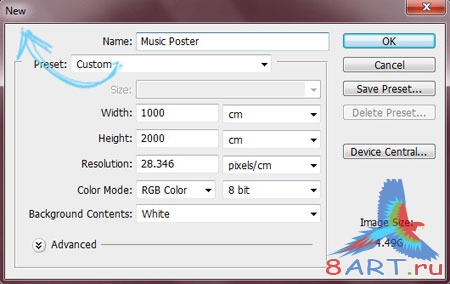
Come in File – New Document(File>New) and set the creation of a new document with a size of 1000px by 2000px.
Step 2
From the source, drag the paper texture into the new document.

Step 3
Create another layer. To do this, go to the menu Layer - New Layer(Layer>New Layer).
Then on the toolbar select Brush(Brush), select the brush type in the top panel. We need a soft round brush. We apply arbitrary abstract strokes with a brush, using different colors(Color). To select a color, you just need to click on the bottom window on the toolbar; there you can see colored squares with the previous and new colors.
Step 4
Now the created abstraction needs to be blurred. To do this, follow the route on the top panel Filter – Blur(Filter>Blur). Choose Gaussian blur(Gaussian Blur).


Step 6
Again create a new layer as indicated in step 3. From the Tools panel, select Straight Lasso(Polygonal lasso) and select the rectangular part at an angle to create a long strip.

Step 7
By using Fills(Fill) Fill the strip with the shade you like. To do this, first click on the tool with the cursor, select a color in the toolbar below (bottom window) and then click on the strip.

Step 8
Now it all depends on your creativity and taste. Make several of the same stripes in different colors, either contrasting or harmonizing.

Step 9
Now you need to change the blending mode. For this we go Layer – Layer Style – Blending Options(Layer > Layer Style > Blend Mode). Select a mode Overlap(Overlay), and also reduce Opacity(Opacity) up to 75%.
Step 10
Open a picture of a guitar and select the guitar. For this you can use quick selection(Quick selection) or straight lasso(Polygonal lasso). When the selection is ready, press Editing - copy(Edit>Copy), and then to our document Editing - Paste(Edit>Paste). You can simply drag the guitar onto our document with the cursor. The guitar layer should be located above the other layers.
If you have a picture of a guitar in png. or psd. formats, you just need to drag the guitar onto your document on top of the other layers.

Step 11
We want the guitar to look real, so we'll give it a shadow. To do this, click Layer – Layer Style – Shadow(Layer > Layer style > Drop shadow).

Step 12
On another newly created layer, again select non-hard round brush(Brush). Now work with the shade #d5652c.

Step 13
You should change the blending mode for the resulting layer along the following path: Layer - Layer Style - Blending Options(Layer > Layer Style > Blend Mode). Then we choose Chroma(Color).

Step 14
Next comes work with brushes. For each brush you need to create a separate layer. Select the Wings brush and set the color to # ffffff. Apply this brush over the guitar, then change the layer blending mode: Layer - Layer Style - Blending Options(Layer > Layer Style > Blend Mode). There in select mode Soft color(Soft light).

Step 15
It's time to use the Flower Patterns brush. Apply them randomly to the guitar, colors will suit # ffffff, #000000 and # ba9b6f.

Step 16
Now brush over the guitar with a round brush of color # 000000 , setting the opacity to 20%. Choosing a tool Eraser(Eraser) and clean it up a little on top of the guitar.

Step 17
Do the same using Circles brushes in different color shades. Place the layers with circles under the layer with the guitar. For convenience, all layers with circles can be grouped. For this we follow the path Layer – Group Layers(Layer> Group with previous).

Step 18
Now let's add some text. Take on the toolbar Text(Text), set the desired parameters – font, font height, color. Click on the document, making sure that the text layer is above the other layers. Type the desired phrase, setting the color # in the text settings 604f34.

Step 19
Let's make the text more beautiful using styles. Let's go Layer – Layer Styles – Stroke(layer>Layer style>Stroke). Select the desired color and stroke thickness in the settings.